x=3+4Rubik’s Cube Competition Density and Correlation with 3x3 Speed
Are the fastest speedcubers the ones who have the most competitions near them?
Introduction
The Rubik’s Cube is a popular 6-sided twisty puzzle first invented in the 1974 by Erno Rubik. Since the late 2000s, the cube’s popularity has made a comeback. Many people enjoy the competitive aspect of the cube, aiming to solve it as fast as possible. The current 3x3 single world record is 3.05 seconds by Xuanyi Geng from China.
Official Rubik’s Cube competitions are governed by the World Cube Association (WCA), an entirely volunteer run non-profit organization. More than 273,000 people have competed in WCA sanctioned competitions. Competitions are held every week worldwide, but the geographic distribution of competition certainly isn’t even.
My project aims to determine the relationship between the density of competitions in a given country and the speed of a country’s competitors. I have 2 main research questions: How are World Cube Association competitions geographically distributed? Is the density of WCA competitions correlated to the speed of the competitors in the region?
Materials and methods
My research questions will be answered with the WCA Results Export. This is a massive dataset that is updated every week. It contains data about each competitor, the number of competitions attended, results and rankings, citizenship, gender, records, and world championship podiums. It also includes information about every competition: location, the number of competitors, what events were held, podium finishers.
There are many metrics to determine 3x3 speed. The WCA records the competitors’ single and average when they compete. The ‘single’ is the fastest single attempt for the puzzle. The average is done taken after 5 solves, with the arithmetic mean taken after the slowest and fastest times are removed. Speedcubers acknowledge that good singles may be achieved with luck, while fast averages require more skill.
3x3 Speed for each country will be determined with 3 variables:
- Mean of the top 25 3x3 averages
- Number of 3x3 Podiums at World Championships
- Number of 3x3 average world records
These 3 variables will be compared to the number of competitions in each country.
I also want to explore each competitor’s speed in relation to the density of competition. I will calculate the geographic center of competitions for each cuber and determine whether faster 3x3 competitors live in regions with more competitions.
Refer to output in your narrative like this: x=7 .
Load any required packages in a code chunk (you may need to install some packages):
library(tidyverse)
library(leaflet)
library(kableExtra)
library(htmlwidgets)
library(widgetframe)
knitr::opts_chunk$set(widgetframe_widgets_dir = 'widgets' )
knitr::opts_chunk$set(cache=TRUE)  # cache the results for quick compiling
Download and clean all required data
n=20
data=data.frame(x=runif(n,-180,180),
                y=runif(n,-60,60),
                size = runif(n, 5, 20),
                category = factor(
                  sample(letters[1:5], n, replace = TRUE)
                  ),
                value = rnorm(n))
data %>%
slice(1:10) %>% #show only 1:n rows
kable(digits=2,align="c")%>% #make table and round to two digits
kable_styling(bootstrap_options =
c("striped", "hover", "condensed", "responsive")) #apply other formatting| x | y | size | category | value |
|---|---|---|---|---|
| -171.54 | -31.21 | 6.96 | b | 1.98 |
| -41.75 | -12.41 | 15.78 | c | -0.43 |
| -133.02 | -26.73 | 5.71 | a | 0.66 |
| 56.75 | 13.07 | 11.25 | d | -1.94 |
| 72.40 | 5.98 | 12.03 | d | 0.38 |
| 81.05 | -54.44 | 11.05 | e | -1.35 |
| -50.13 | 25.92 | 18.71 | d | -0.83 |
| 125.57 | 55.85 | 16.76 | b | -2.14 |
| 60.76 | 43.86 | 17.26 | e | 0.07 |
| -118.58 | 58.75 | 5.32 | a | -0.02 |
Add any additional processing steps here.
Results
[~200 words]
Tables and figures (maps and other graphics) are carefully planned to convey the results of your analysis. Intense exploration and evidence of many trials and failures. The author looked at the data in many different ways before coming to the final presentation of the data.
Show tables, plots, etc. and describe them.
m <- leaflet(data) %>%
  addTiles() %>%
  addCircleMarkers(~x, ~y, radius = ~size,color = ~as.factor(category)) %>%
  addPopups(~x[2], ~y[2], "Random popup")
m  # a map with the default OSM tile layer
Map of completely random data
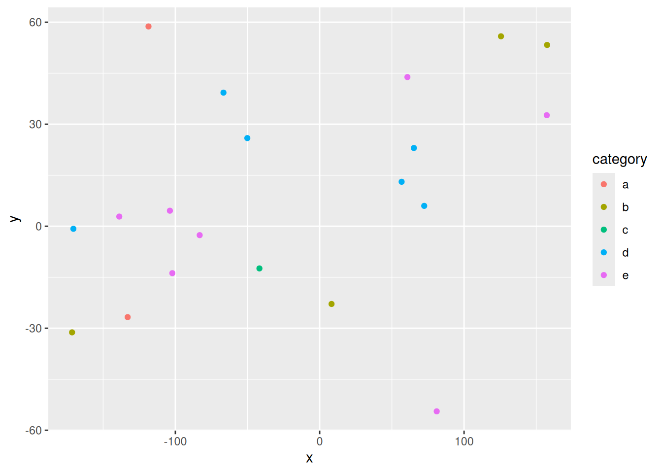
data %>%
  ggplot(aes(x=x,y=y,col=category))+
  geom_point()
Dygraphs Example
library(dygraphs)
dygraph(nhtemp, main = "New Haven Temperatures") |>
  dyRangeSelector(dateWindow = c("1920-01-01", "1960-01-01"))
Conclusions
[~200 words]
Clear summary adequately describing the results and putting them in context. Discussion of further questions and ways to continue investigation.
References
All sources are cited in a consistent manner